PROUD STUTTER PODCAST
PROUD STUTTER PODCAST
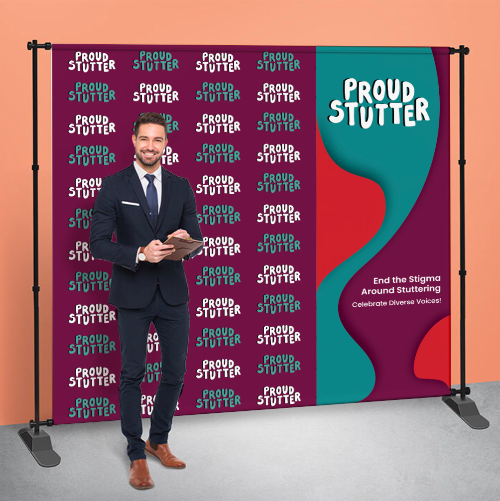
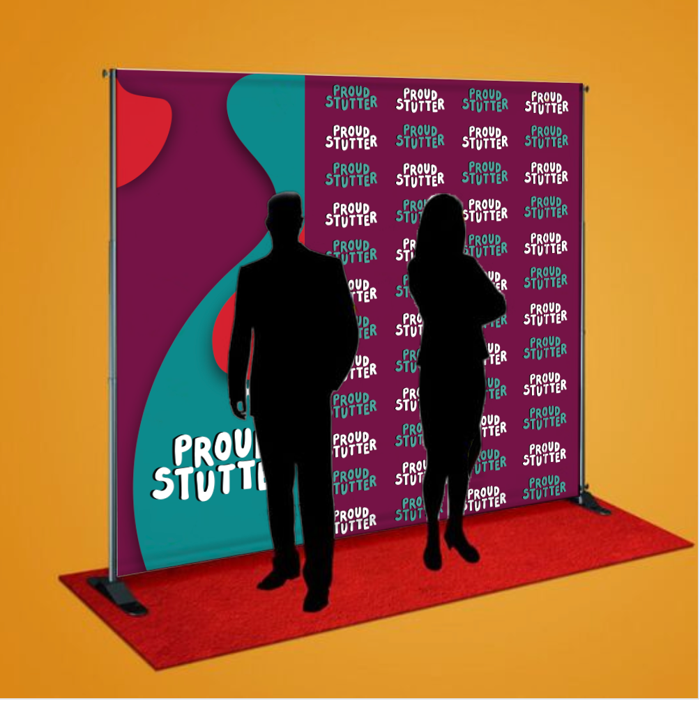
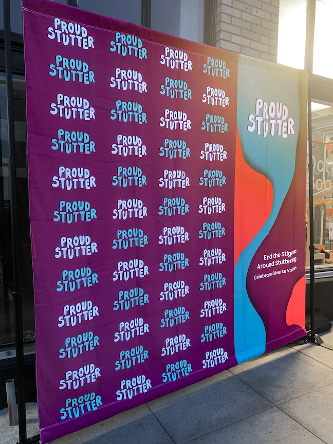
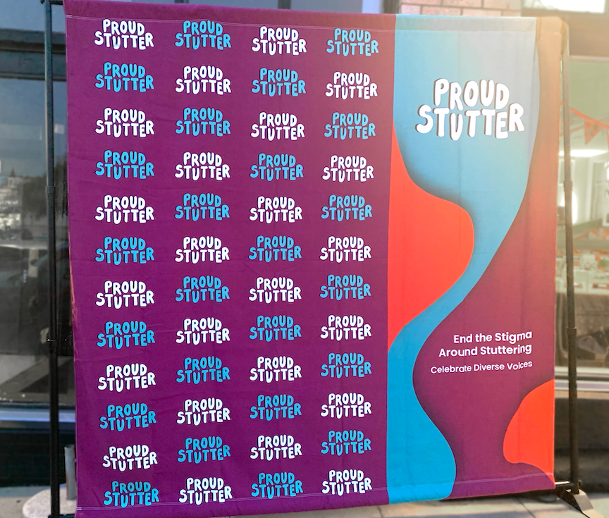
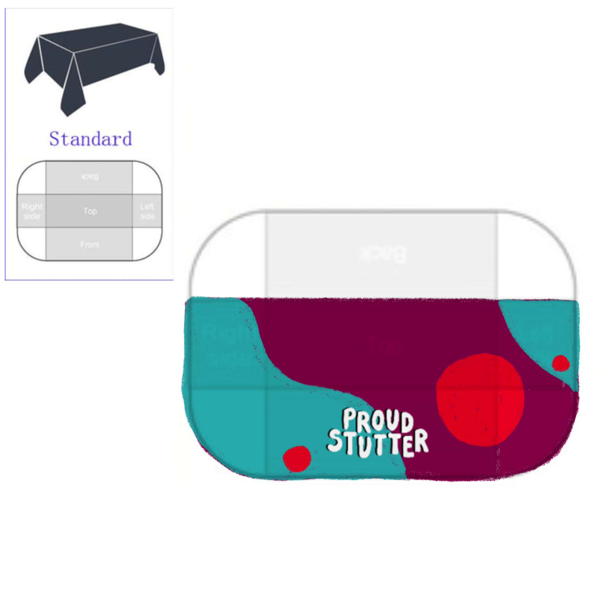
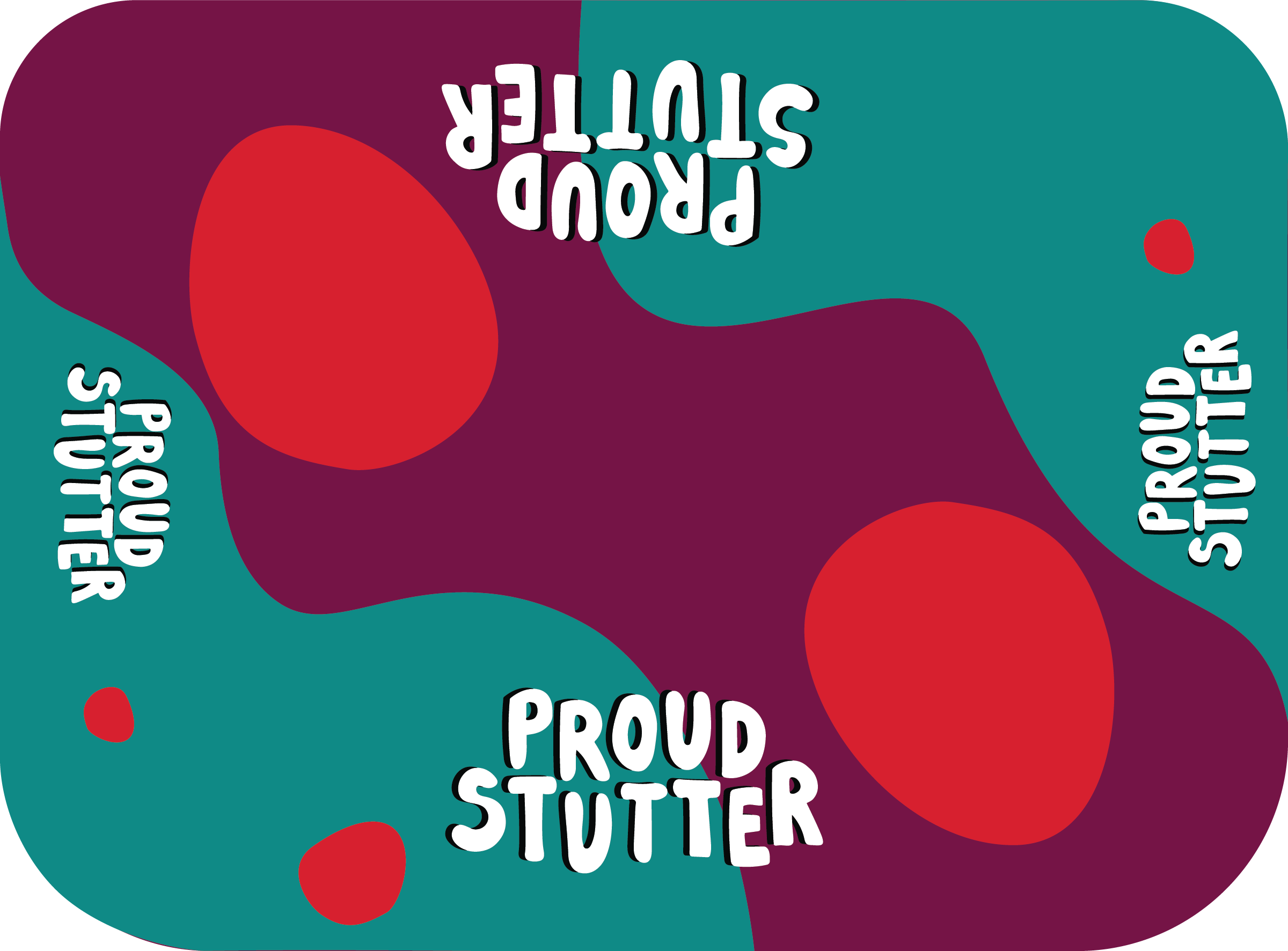
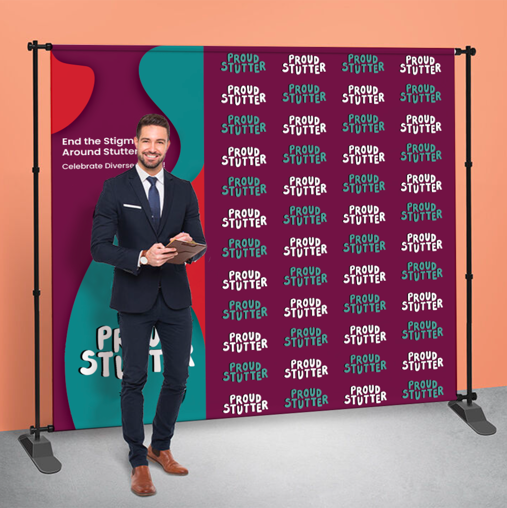
Event retractable banners, bookmarks, tablecloths, and a step-and-repeat for Proud Stutter.
I started with an animation to promote Proud Stutter’s positive message to end the stigma around stuttering and encourage diverse voices. Soon, the Director and Founder of Proud Stutter wanted me to utilize the way I managed my typography in the animation to design event material.
The Animation:
After a few rough sketches, we all agreed to continue with a few more sketches with the bottom left sketch. More simplicity and more flow-like shapes.
Sketches: 1st one

Sketches: 2nd draft

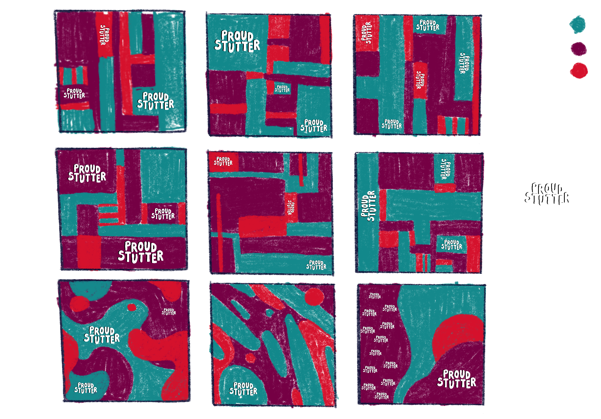
Still, it felt off, so I set it to the side and showed them designs for the retractable banners.
Sketches:
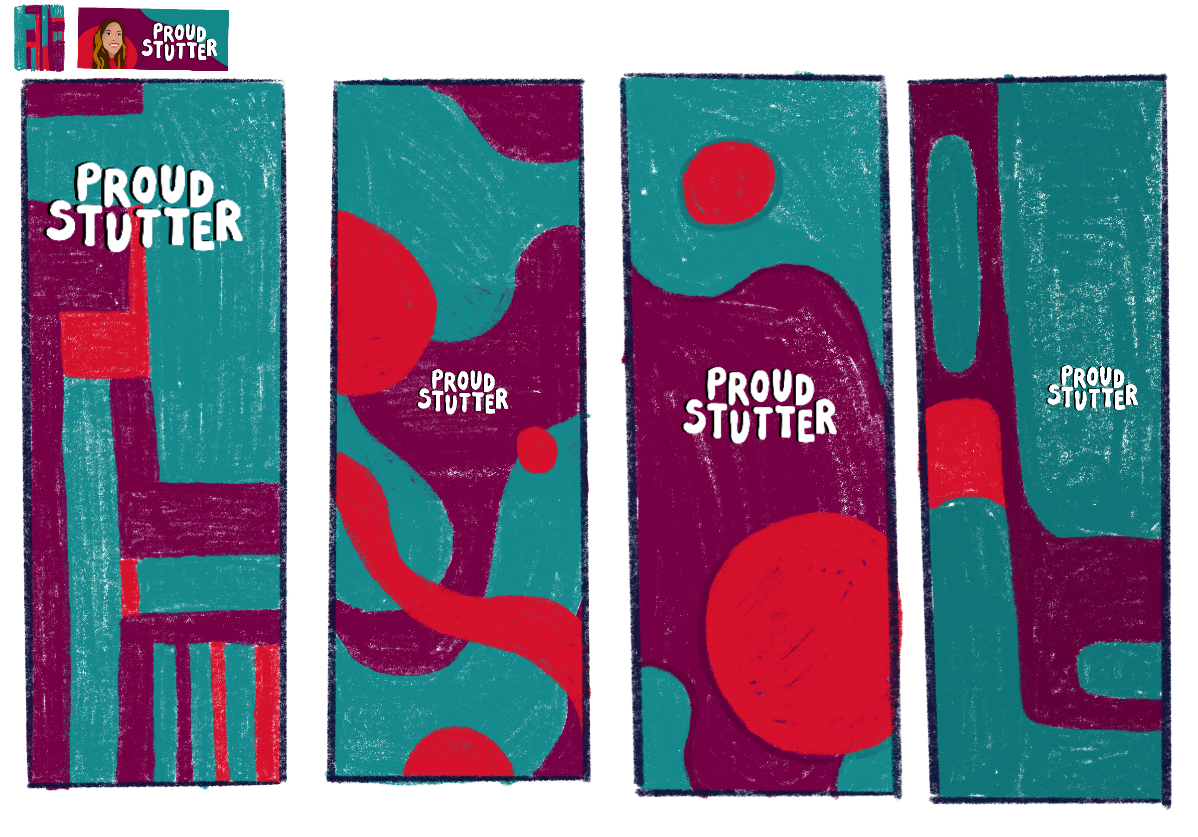
I began playing around with the two banner sketches in the center and showed them a few more. Soon, one draft suited the intention of Proud Stutter.
Drafts:
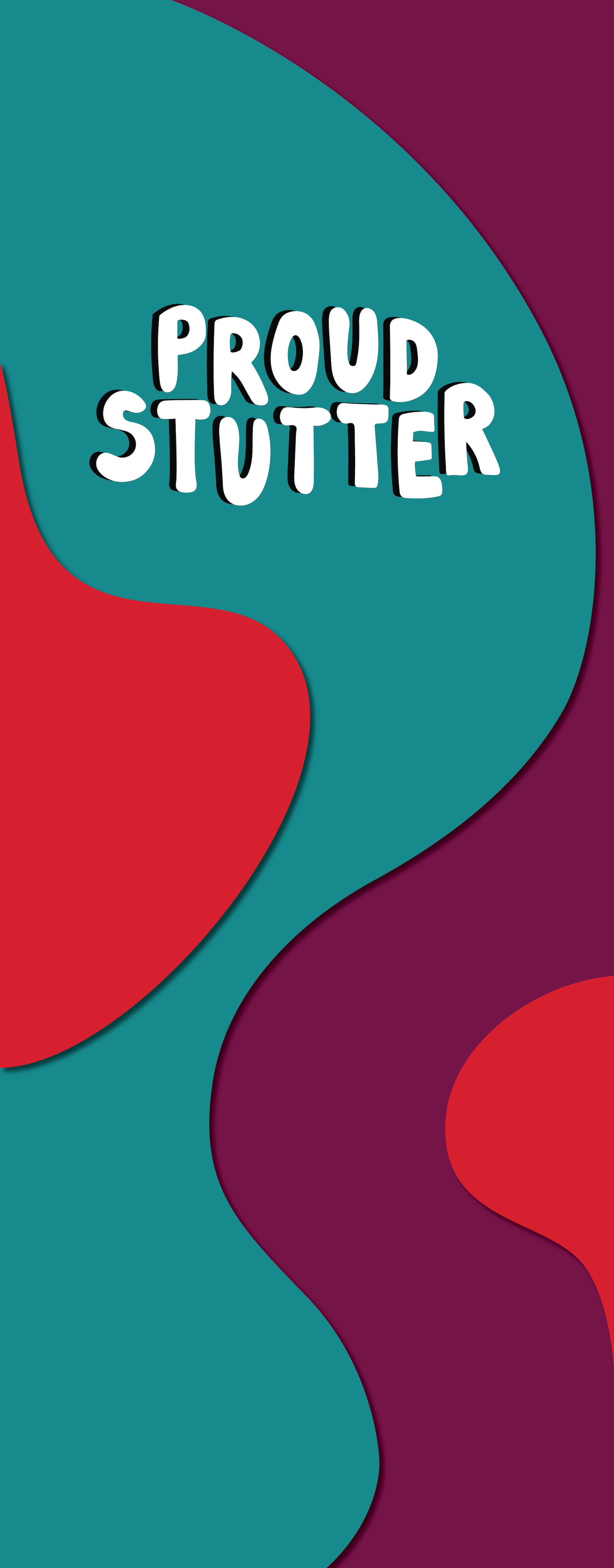

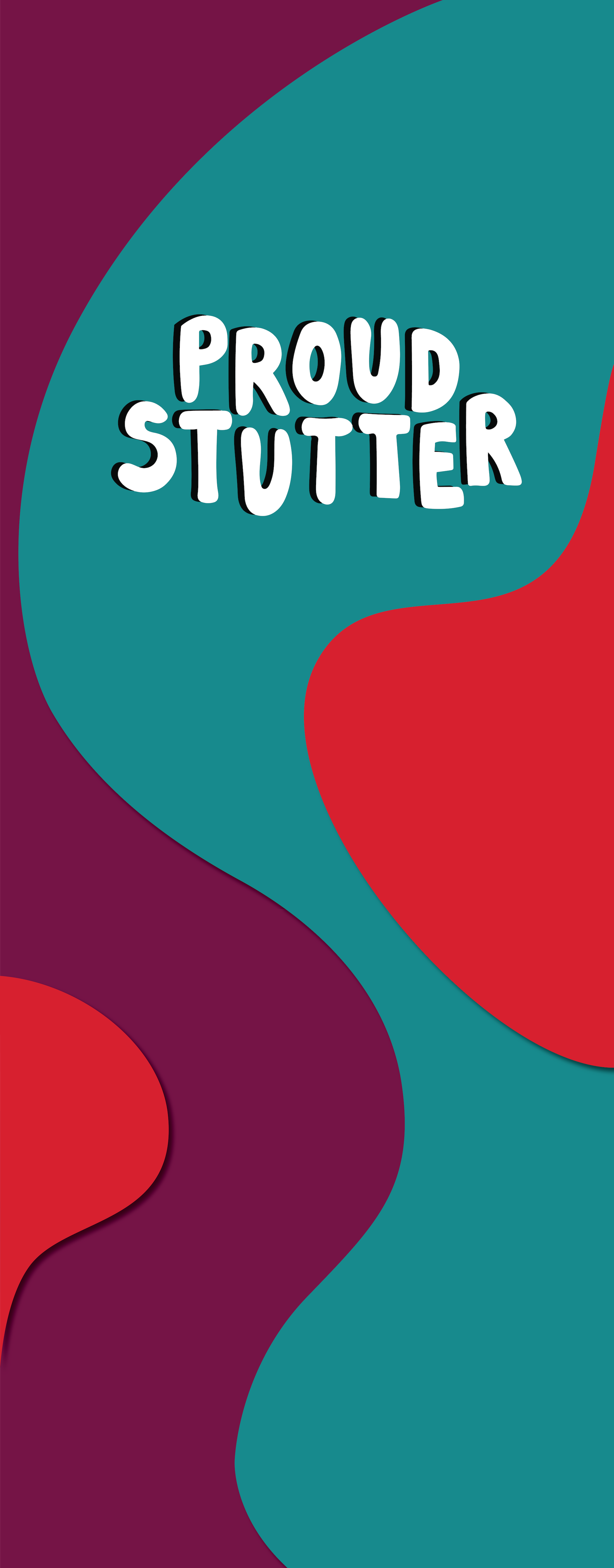
The two retractable banners became mirrored in one design.
The tablecloth became simpler to design because we intended to make all event materials align with one another.
Sketch:
 .
. 
Back to the Step-and-repeat, I added a few more sketches with the design of the retractable banner.
Sketches:

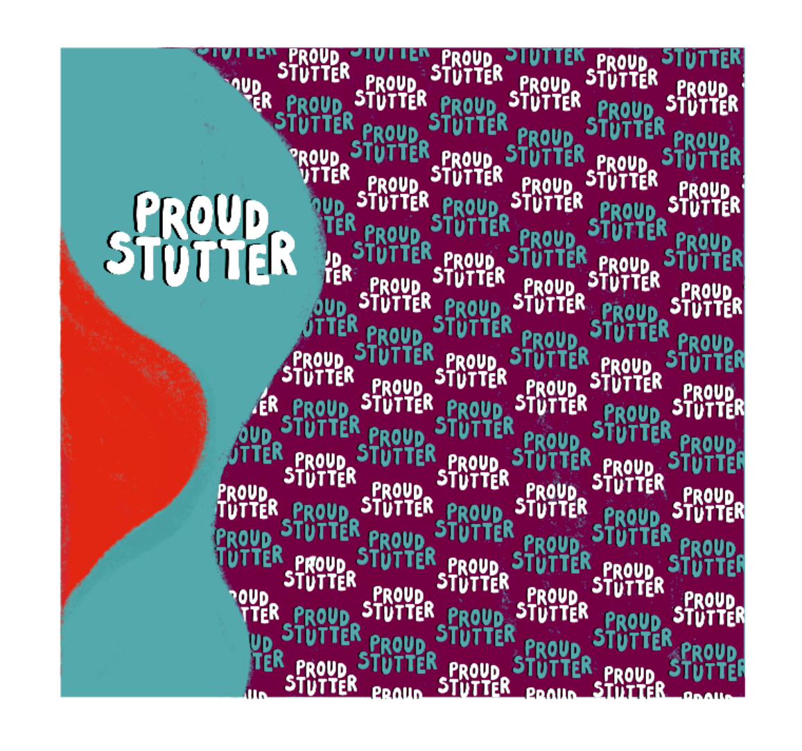
Draft:
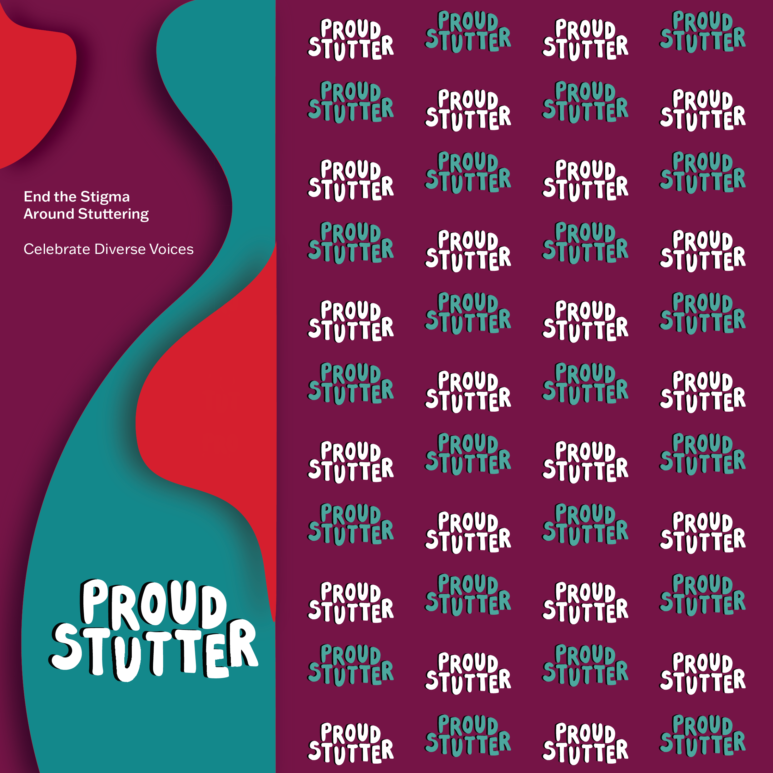
I included quick mockups to see which direction to move forward with.
![]() .
. ![]()
![]()
![]()
Please click here to see more of all event materials!
︎︎︎
 PROUD STUTTER: PATIENCE
 .
. 